Menu

THE UFFIZI GALLERY - AUDIO GUIDE APP

Focus on the art,
not the app

Each year, nearly 3 million people visit the Uffizi Gallery, yet there’s still no official audio guide to help them admire the world-renowned collection. I designed a universal audio guide app that allows anyone, from anywhere, to explore the Uffizi with ease and intention. An app that helps visitors focus on the art itself, not the device in their hands.

Audio Guide

App

Accessibility

Usability

Conceptual

My role

UX/UI Designer

Product Designer

Deliverables

Prototype

Design System

Team

Mentor (Senior UX Designer)

Timeline

2025

PROBLEM

Lost in application

While visiting several museums in different countries, I found myself frustrated with the audio guide apps. Each one had a different interface, rigid and I almost felt like they were built just to tick a box for compliance, not for users. And later when I was talking with friends about it, some of them told me they never use an audio guide app because they feel it’s waste of time and the source of unwanted frustration.

SOLUTION

Let the art speak for itself

I designed a lightweight, multilingual audio guide app that prioritizes accessibility, ease of use, and user autonomy. The app supports offline access, multiple languages, dark/light mode, bigger default font size, and audio speed controls. The interface is designed to reduce screen dependence, allowing visitors to stay immersed in the art.

Oh! You haven't jumped to the result. Let's dive in.

🤿

Project Goal

The primary goal is to provide a seamless and accessible audio guide that creates lasting memories for the gallery's millions of visitors.

Effortless & inclusive

The app must be immediately usable by people of all ages, abilities, and technical skills, with no technical barriers.

Focus on the art

The app should disappear into the background, allowing the art to be the main focus of the visit.

Autonomy

Users must have full control over their experience, from language selection to the depth of information they receive.

Research & Insights

I conducted a user interview with 5 people who have used audio guide app in the past. The user research revealed that people avoid using audio guides because they are unhandy, require mobile data, or are confusing to use. Common pain points included difficult navigation, app bloat (taking up memory, storage, battery), poor accessibility, limited language support, and people with visual impairments struggle with tiny text size. Users want to focus on the art, not on fiddling with a device.

Quotes from the interview

“It's a hassle to download and set up.”

“If they had the guide in my language, I could memorize the exhibition better.”

“I found myself looking at the phone screen rather than the exhibition.”

“I wanted to pause and play but the audio guide went back to the beginning each time.”

Pain points

Lack of native language support.

→ Anlayse visitor nationality
→ Apply AI translation

The setup process feels unnecessary for a one-time use.

→ None to minimal setup
→ Pre-visit reminder

Users perceive many audio guide apps as obligatory and uninspired.

→ Offer thematic tours
→ End of tour recap

Cumbersome navigation interrupts the experience.

→ Larger playback controls
→ Dark mode as default

→ Organic IA

'It’s not your fat finger,
it’s touch targets.'

— A legendary proverb, 1990 AD

Empathize & Define

I invested the largest portion of my project resources in the empathize phase for good reason. These apps are often designed for one-time use, and usually, they completely miss the chance to create a lasting connection with users. Considering the potential reach (millions of visitors downloading and interacting with the app!), this is a huge lost opportunity. Due to its short lifespan, users tend to overlook inconveniences, forget about them quickly, or avoid engaging deeply. I wanted to go beyond assumptions and truly understand these behaviors and pain points.

Aggregated empathy map

Says

“I couldn’t use the pause or rewind button because of bugs.”

“I couldn’t use the pause or rewind button because of bugs.”

“I don’t want to waste mobile data for a one-time visit.”

“I don’t want to waste mobile data for a one-time visit.”

"It's a hassle to download and set up."

"It's a hassle to download and set up."

“The language support wasn’t there. I gave up on using the app.”

“The language support wasn’t there. I gave up on using the app.”

Thinks

“This should be simpler. Why is it so hard to just listen and enjoy?”

“This should be simpler. Why is it so hard to just listen and enjoy?”

“I'm worried about my phone's data and storage.”

“I'm worried about my phone's data and storage.”

“The guide should help me focus on the art, not distract me.”

“The guide should help me focus on the art, not distract me.”

“If it doesn’t support my native language, it’s a struggle to stay engaged.”

“If it doesn’t support my native language, it’s a struggle to stay engaged.”

Does

Fumbles with controls and app navigation

Avoids downloading apps

Tries audio guide apps but gives up if they don’t work well or are tedious to use

Skips content that is too long or boring

Feels

Frustrated by technical glitches, bright screens, or confusing interfaces

Disconnected from the exhibit due to tech or language barriers

Embarrassed or excluded when accessibility and language needs are not met

Anxious about practical issues like data, storage, and battery

User persona & Journey map

User persona

Maud

21 / Rotterdam, Netherlands

Occupation

Education

Status

Part-time barista

High school graduate

Lives with a roommate

Spontaneous

Intuitive

Disciplined

Easygoing

Tech level

Native user with limitations

I just want the interesting bits. If it's too much hassle or boring, I'd rather just look at the art on my own.

Frustrations

App downloads feel like too much effort

Detailed and academic audio makes it boring

Data usage is a concern when abroad

Goals

Avoid any process that requires multiple, bothersome steps

Interesting, bite-sized information about the art

Something lightweight that doesn’t eat up data or storage

Stage

Planning visit

App download

Starting the tour

During the tour

End of visit

Actions

Spontaneously visits museum

Decides not to download app

Walk through the exhibition on her own

Reads the printed labels on a few art pieces that catch her eye

Remembers visuals, not details / Takes a few photos outside and posts

Thinks

“Hope it’s easy to use.”

"Ugh, a download? I barely have any data left and my storage is almost full.”

"I'll just look at what seems cool. The audio guide is boring anyway."

“I’ll just take some pictures.”

"That was a cool museum. Glad I saw the famous stuff."

Feels

Casual, hopeful

😊

Lazy, unmotivated

🥱

Independent, unbothered

😎

Carefree

😉

Satisfied (exhibition) Indifferent (app)

😍

😐

Pain points

Download becomes a barrier

Large file size, unclear value

loses a potential user due to the high-friction onboarding

No connection, boring content

Misses the opportunity to engage with visitor

Opportunities

Promote QR-based instant play

Offer no download lightweight mode

More playful/visual content

Offer top tours or highlight reels

Create shareable content from the app

Ricky

62 / San Diego, CA, US

Occupation

Education

Status

Small business owner

MBA

Lives with wife

Discerning

Patient

Deliberate

Curious

Tech level

Intermediate

I want to enjoy the art, not get lost in my phone screen.

Frustrations

Difficulty seeing screen text with small fonts

Needing to look at the screen often to stay on track

Fumbling with clunky audio controls, forcing him to rewind repeatedly

Goals

To experience exhibitions without distractions

Simple, intuitive controls (pause, play, rewind)

Visual comfort (dark mode, large font)

Stage

Planning visit

App download

Starting the tour

During the tour

End of visit

Actions

Searches museum info

Tries downloading app abroad

Starts guide, looks for pause/play

Checks phone often, misses audio cues

Talks with partner about the visit

Thinks

“I hope they have an easy guide.”

“Is this going to eat my data?”

“How do I pause this again?”

“I’m missing what it’s saying. The screen is so bright, my eyes are tired.”

“Could’ve been better without the fuss.”

Feels

Curious, open

🙂

Hesitant, annoyed

😕

Frustrated

😤

Distracted, irritated

🤨

Relieved

😌

Pain points

Little advance info

Large file size, poor Wi-Fi/data

Unclear controls

Hard to focus on art

Disconnected from content

Opportunities

Promote audio guide upfront

Provide offline version/light app

Use big buttons, visual pause cues

Audio automatically sync with art / Default dark mode

Offer in-app tour summary & feedback

Bence

36 / Budapest, Hungary

Occupation

Education

Status

Freelance programmer

BSc in Computer Science

Lives alone

Analytical

Efficient

Independent

Minimalistic

Tech level

Expert

If I have to think about how to use the app, it has already failed.

Frustrations

Apps that bundle too many features together, creating a confusing experience

Confusing UI when in a rush

Native language often not supported

Goals

A seamless user experience with minimal setup

Clear separation between ticketing and guides

Language options that support diverse users

Stage

Planning visit

App download

Starting the tour

During the tour

End of visit

Actions

Buys ticket online and downloads app at home to be prepared

Goes through the registration and tour selection process

Navigates app easily

Notices lack of Hungarian language

Considers leaving a detailed, critical review on the app store

Thinks

“Let’s see how well designed this is.”

“Why is this asking for registration? Wasn’t buying a ticket enough?”

“Works, but too much stuff in one app.”

“Too bad my language isn’t here.”

“Decent attempt, not quite there yet. 2 starts for the idea.”

Feels

Curious, open

🙂

Critical, impatient, skeptical

🤨

Tolerant, analytical

🤓

Detached

😟

Neutral to unimpressed

🧐

Pain points

Poor instruction about registration

Registration/data during travel

Not intuitive to a technical user

Language barrier

App not up to the standards of a tech-savvy user, potentially leading to negative reviews

Opportunities

Email prep checklist

App with no registration

Logical IA and simple interface

Make language selection the first, AI powered translation

Offer a direct feedback channel for technical suggestions

How might we design a light, intuitive, and inclusive audio guide that truly serves the visitor?

Ideate & Prototype

I used different ideation tools including Crazy 8,s, user flows, storyboard, and wireframes.

I led ideation sessions with stakeholders and the website agency to brainstorm structural and content improvements. I created preliminary layouts in an MS Word file specifically for all non-designer stakeholders.

Crazy 8

User flow

Wireframe

Design system

Key features

Default dark mode

Big play/pause button

Feedback & Share

Opportunities

Meaningful findings from the User Journey Map.

Provide offline version

Offer top tours or thematic tours

Create shareable content from the app

Use big buttons, visual pause cues

Make language selection the first, AI powered translation

Offer a direct feedback channel for technical suggestions

High fidelity mockup
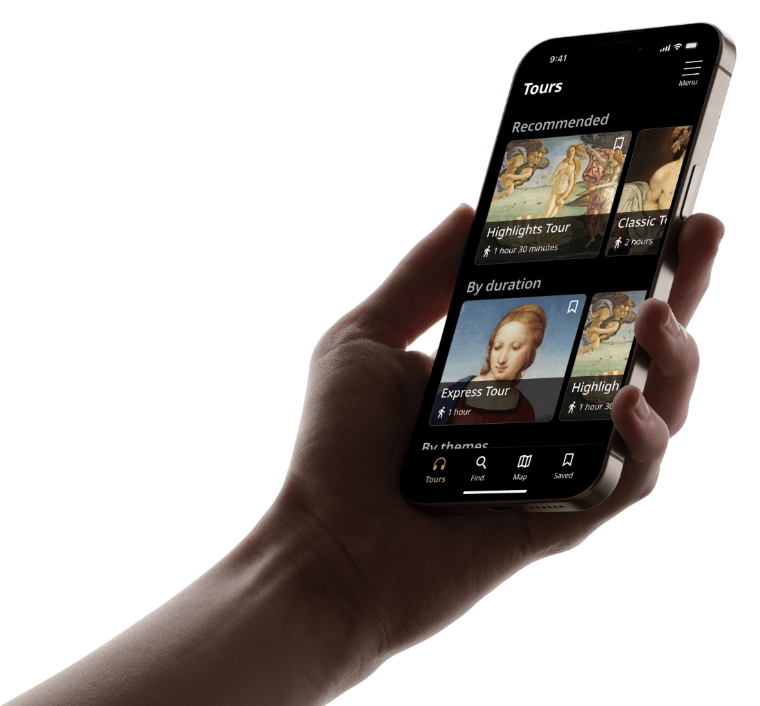
Result

App for all ages

Designed with accessibility in mind. Default dark mode, large text, intuitive play/pause controls, and a minimum touch target size of 48×48 px ensure ease of use for everyone.

App that works

Offline access enables users to download tours in advance, making it ideal for international visitors with limited mobile data.

Share & reflect

At the end of each tour, users can highlight favorite moments and leave a simple rating

Key takeaway

Real voice makes a difference

Although this was a conceptual project, I took user research seriously. Interviewing users revealed real pain points and unexpected insights that shaped the direction of the design.

Prioritize users, always

Good apps are not just well-intended, they are user-centred. Especially for universal app like audio guides, designing for experience (not assumptions) makes all the difference.

Equitable and accessible design

Great design includes those at the edges, not just people in the center of the Venn diagram. Accessibility and inclusion should never be an afterthought, but a starting point.

Hurrah! You made it all the way here.
I appreciate your time.

See other projects

Kyungsun Won

Available to talk!

Designed by Kyungsun Won with Figma & Framer © 2025

Kyungsun Won

Available to talk!

Designed by Kyungsun Won with Figma & Framer © 2025

Kyungsun Won

Available to talk!

Designed by Kyungsun Won with Figma & Framer © 2025